Empire Clean Cities Website Usability Study
About the Project
Empire Clean Cities (ECC) is an environmental not-for-profit organization working to assist in the reduction of petroleum consumption in the transportation sector. They are part of the US Department of Energy’s Clean Cities Coalition Network, which works to get individuals, municipalities, and industry partners information, incentive funding, and support for legislation on implementing alternative fuels and infrastructure, advanced vehicles, and fuel-saving strategies locally. This study aims to assess the usability of ECC’s newly redesigned website that was launched in the summer of 2019.
Team & Roles
As with all project teams for The Center for Digital Experiences, the Empire Clean Cities team consisted of four interdisciplinary UX Consultants. These included two data analytics and visualization specialists and two information experience designers. Together, we designed tasks for a remote moderated user test, conducted user tests, developed pre and post-test questionnaires, evaluated qualitative data analysis, and formulated recommendations based on our findings. Additionally, we each contributed to the report and virtual-in-person presentation of our findings. Supplemental to these tasks, my primary roles included project organization, development of the participant recruitment strategy, and data analysis.
Team Meeting
Our team tested out the user test with each other on Google Meet and with four pilot tests.
Overall Process
Recruitment
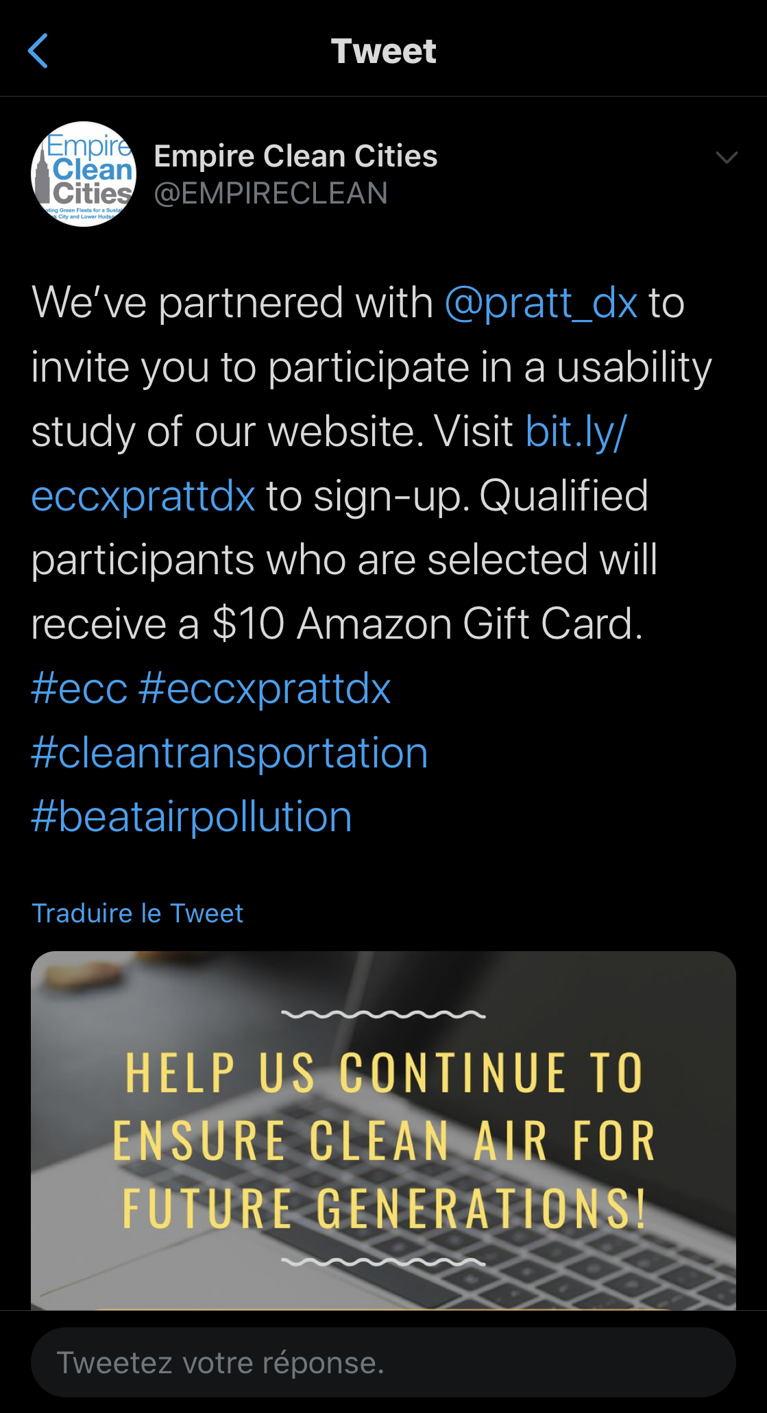
Balancing information we received from ECC during our initial meetings, and working within the constraints of quarantine, we developed a user profile, termed the “Environmentally Conscious Individual,” that would be applicable to both industry stakeholders and specific populations of the general public. Seeking to recruit the widest possible audience, with the assistance of ECC, we employed a social media campaign, as it had the potential to reach approximately 19,300 people across all social media platforms. The use of social media was successful in contributing 22 of the 36 recruits we received over the course of 4 days. From these potential participants, our team gathered a testing pool of 15 individuals, of which 7 users completed the tests with us. These test participants included 1 ECC Member, 3 individuals who had familiarity with ECC, and 3 individuals that did not. Apart from fitting our user profile, our logic for selecting these individuals was that “Industry partners are people too!”—and the industry members who connect with or are likely to join ECC share similar beliefs in alternative energy and are desirous to see such changes in their company’s operations.
Learn more about our selected test participants here:
The Test
The remote moderated user test on Google Meet consisted of three parts:
The Pre-Test Questionnaire, which acknowledged the user’s consent to participate, and provided basic information on them, including: their age range, gender, marital status, social media usage, motorized vehicle ownership, their potential for purchasing an electric vehicle (EV), their familiarity with ECC and the Clean Cities Coalition Network, as well ad, their willingness to volunteer.
Five tasks designed to guide the user through the site and discover:
a. Newsletters.
b. Volunteer Opportunities.
c. Economic Incentives for purchasing an EV.
d. Locating EV charging stations near a location, and
e. Industry membership benefits and opportunities.
The Post-Test Questionnaire, which assessed the user’s overall experience on the site as they worked through the tasks, the degree to which the site’s aesthetics contributed to their experience, and an opportunity for them to provide their input.
Each participant was tested by two members of our team—one moderator and one observer—guided the user through the test. Using Meet, the tasks were placed into the chat feature, and each user’s screen and voice were recorded. The users were asked to “think aloud” as they completed each task. Once the test was completed and the user left the Meet, each team then discussed their observations, and submitted their notes to a log for all the team to review.
The Test in Action
Screenshot from video of me conducting a user test.
Screenshot of a user during the test.
Insights and Recommendations
Overall the tested users were impressed by the site’s content and wealth of information. However, with so much information, users were also uncertain of where to find things. In fact, when asked to verify the degree to which they were able to locate what they were looking for easily, only 1 of 7 responded with a somewhat easy. This feeling of uncertainty also underscored issues throughout the site, such as scannability, use of language/terminology, navigation, and hierarchy. We proposed four recommendations:
Emphasize ECC’s opportunities for users and informative site features through more prominent placement and graphic treatments.
Adjust language and navigational structure to more clearly include and communicate with all ECC users and audiesnces.
Increase scannabiltiy and content discoverability through button or tab prominence text hierarchy.
Improve comparability of Membership level options and similar tabular information through highlighting contrast and structure.
Additionally, we recommended that ECC consider an information architecture study to evaluate the structuring, organization, and labeling of content to fully understand how users are interacting with the website.


